In many introductory physics classes and labs, students are frequently taught that measurements will follow a Gaussian distribution. However, this is often a misunderstanding of how the normal distribution arises. Physical populations can follow many non-Gaussian distributions.
This post explores why the Gaussian distribution is not an inherent property of individual measurements, but rather a property of the sample average, as described by the Central Limit Theorem (CLT).
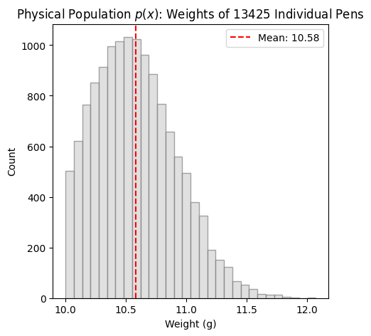
Population distribution, \(p(x)\)
Before looking at sample averages, the “ground truth” of our data is built. In this example, population has weight with a probability density distribution \(p(x)\), resulting as an example from a factory production line for pens. While the machine produces a standard spread, a quality control process rejects any pen weighing less than a specific threshold (e.g., 10g).
The resulting distribution of this process is a left-truncated Gaussian: it features a sharp “cliff” on the left and a natural decay on the right. Clearly, the individual items in this population do not follow a standard bell curve.
Remark. Different processes may produce individuals following different probability densities. As an example, there’s a bimodal distribution already implemented: just open this file in Colab, clicking on the button “Open in Colab”, under the Code Links, uncomment those lines and run this script.
Show the code
import numpy as npimport matplotlib.pyplot as pltnp.random.seed(42)# Create a non-Gaussian population:#> Left truncated Gaussian# 1. Standard Gaussianmu_factory =10.5sigma_factory =0.4raw_production = np.random.normal(mu_factory, sigma_factory, 15000)# 2. Apply Quality Control: Cut everything below 9.2gthreshold =10.population = raw_production[raw_production >= threshold]pop_size =len(population)"""#> Bimodal distribution# 40% are "Light" pens (10g), 60% are "Heavy" pens (15g)pop_size = 100_000group1 = np.random.normal(10, 0.8, int(pop_size * 0.4))group2 = np.random.normal(15, 1.5, int(pop_size * 0.6))population = np.concatenate([group1, group2])"""plt.figure(figsize=(5, 5))plt.hist(population, bins=30, color='lightgray', edgecolor='gray', alpha=0.7)plt.axvline(np.mean(population), color='red', linestyle='--', label=f'Mean: {np.mean(population):.2f}')plt.title(f"Physical Population $p(x)$: Weights of {pop_size} Individual Pens")plt.xlabel("Weight (g)")plt.ylabel("Count")plt.legend()plt.show()
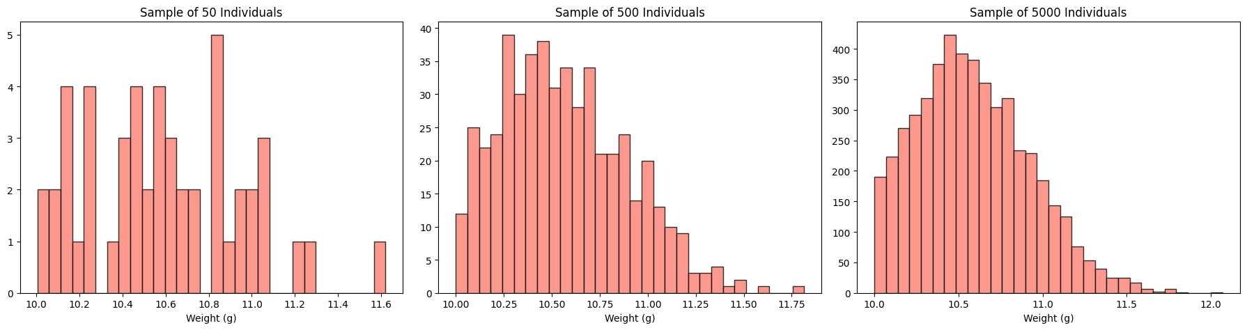
The fallacy: “more samples make the distribution Gaussian”
A common misunderstanding is that collecting more data will “fix the distribution” and make it look normal. This is not true! Sampling individuals from the population, as the number of individuals \(n\) in a sample increases they follow the very same distribution \(p(x)\) of the whole population.
As the sample size is increased from \(50\) to \(5000\) individuals, the histogram simply becomes a more accurate representation of the truncated population with probability density \(p(x)\). The “cliff” of the left-truncated distribution remains vertical. This shows that a large dataset of individual measurements does not “naturally become Gaussian” if the underlying population is not.
Show the code
sample_sizes = [50, 500, 5000]fig, axes = plt.subplots(1, 3, figsize=(18, 5))for i, n inenumerate(sample_sizes): sample = np.random.choice(population, size=n) axes[i].hist(sample, bins=30, color='salmon', edgecolor='black', alpha=0.8) axes[i].set_title(f"Sample of {n} Individuals") axes[i].set_xlabel("Weight (g)")plt.suptitle("", fontsize=16)plt.tight_layout()plt.show()
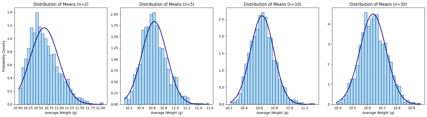
Correct application of the central limit theorem
The Central Limit Theorem (CLT) makes a very specific claim: it is not the individuals that become Gaussian, but the sum (or sample average, \(\overline{X}_n\)) of those individuals,
To see this, we take many random “samples”, each of \(n\) individuals and calculate the average weight for each cluster.
This process is repeated for different values of \(n\). As the number \(n\) increases, the sample average tends to a random variable with a Gaussian probability distribution, centered at the population mean \(\mu\), and with variance that decreases with \(1/n\), i.e. for “large” \(n\)
being \(\sigma^2\) the (finite) variance of the population \(p(x)\).
Show the code
def plot_sampling_distribution(pop, n_values, iterations=1000): fig, axes = plt.subplots(1, len(n_values), figsize=(18, 5))for i, n inenumerate(n_values):# The CLT step: calculate the mean of 'n' random pens, 2000 times sample_means = [np.mean(np.random.choice(pop, size=n)) for _ inrange(iterations)]# Plotting the means axes[i].hist(sample_means, bins=30, color='skyblue', edgecolor='navy', density=True, alpha=0.7)# Add a theoretical normal curve for comparison mu = np.mean(pop) sigma_mean = np.std(pop) / np.sqrt(n) x = np.linspace(min(sample_means), max(sample_means), 100) p = (1/ (sigma_mean * np.sqrt(2* np.pi))) * np.exp(-0.5* ((x - mu) / sigma_mean)**2) axes[i].plot(x, p, color='darkblue', linewidth=2, label='Normal Dist.') axes[i].set_title(f"Distribution of Means (n={n})") axes[i].set_xlabel("Average Weight (g)")if i ==0: axes[i].set_ylabel("Probability Density")plot_sampling_distribution(population, n_values=[2, 5, 10, 30])plt.tight_layout()plt.show()